 As our film is under the social realism genre, we discussed what shots would be most appropriate with the tone of our trailer. We decided that our poster should reflect the trailer and therefore should include to some extent the symbolism that we have included as it makes up a part of the narrative. One of our primary ideas was to base the design of our poster off of the image found on our blogs background.
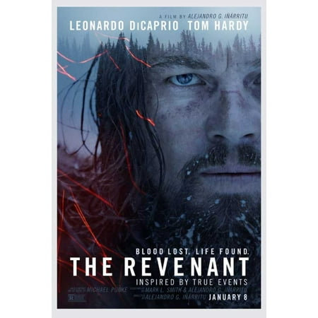
This idea was further explored with how we could frame the actresses face to allow us to blend our symbolism in. Art drawn for the film "The Girl With the Dragon Tattoo" gave us a key framing shot that we would be able to explore for our piece. As this film has a similar narrative to our piece in the sense that the female protagonist is sexually assaulted, we thought that drawing inspiration from this would bring us closer to producing a product that would achieve the requirements of a poster for our selected genre.
To create a poster that will lead to people wanting to see the piece, designers need to find a way to make sure that they create something that is both easy to read but maybe also somewhat inviting to figure out the plot. A film poster can include often just a close up shot of one of the main characters (thus an audience of people who like that actor/actress will be attracted) however the design can almost give away an entire plot.
Its often worth considering the colour palette in the poster as much as in the film trailer. The Revenant's poster for example is filled with blues and greys and colder colours. This foreshadows what most of the films setting is based around. The Girl With The Dragon Tattoo again uses a greyscale palette to create a lifeless aura to the piece (the film itself dealing with current issues that cause emotional damage such as sexual assault)
No comments:
Post a Comment